Showing posts with label maps. Show all posts

Friday, February 22, 2008

Guam Island Map

guam map Map of Guam (more Guam Maps)
(description via Wikipedia) Guam, officially the Territory of Guam, is an island in the Western Pacific Ocean and is an organized unincorporated territory of the United States. It is one of five U.S. territories with established civilian government.[1] The island's capital is Hagåtña (formerly Agana). Guam is the largest and southernmost of the Mariana Islands.

The Chamorros, Guam's indigenous inhabitants, first populated the island approximately 6,000 years ago. The island has a long history of European colonialism beginning in 1668 with the arrival of Spanish settlers including Padre San Vitores, a Spanish missionary. The island was captured from Spain by the United States during the Spanish American War in 1898. As the largest island in Micronesia and the only American-held island in the region before World War II, Guam was occupied by the Japanese between December 1941 and July 1944. Today, Guam's economy is mainly supported by tourism (primarily from Japan) and U.S. military bases.

Thursday, February 07, 2008

Map of Popularity of SIRIUS in Each State

Map of Sirius Radio subscribers
A group has created a new interactive map showing the popularity of satellite radio company Sirius. Each state has a breakdown based on the sales of this particular company and they are not the actual figures set out by Sirius. However, it does show a nice cross section of the popularity of Sirius by the population of the U.S. (source)

Saturday, February 02, 2008

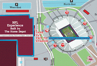
Super Bowl XLII Interactive Map

super bowl map The NFL has created an interactive map of the Super Bowl for fans and visitors. This years site is at the University of Phoenix Stadium in Glendale, Arizona, featuring the new stadium with retractable roof and field.

The map features the events going on around the stadium as well as a close-up map of the stadium and field itself.

Tuesday, January 01, 2008

Mapping Slavery in America

Edwin Hergesheimer’s map of Southern slavery was printed in September of 1861 and sold to raise money for sick and wounded Union soldiers. It identified the percentage of the population enslaved in each county, and the total number of slaves—four million, up from 700,000 in 1790—was a figure that could not have gone unnoticed by Americans living through such violent upheaval. By using this relatively new “choropleth” technique of shading, Hergesheimer showed Americans their country through the lens of slavery.

The “slave map” was of particular interest to President Abraham Lincoln, as illustrated in a painting by Francis Bichnell Carpenter, First Reading of the Emancipation Proclamation of President Lincoln. The artist spent six months living at the White House in order to complete this work, and in that time repeatedly observed Lincoln studying the map.

To master the detail on the map for his painting, Carpenter surreptitiously borrowed it; and when the president visited the artist in his White House studio a few days later he remarked, “You have appropriated my map, have you? I have been looking all around for it.” According to Carpenter, Lincoln was once again instantly absorbed by the map and used it to trace the recent progress of Union troops through Virginia.

It gave Lincoln happy news, for the areas conquered by the Union just that week were densely populated with slaves. Thus Hergesheimer’s map appears in the corner of Carpenter’s painting, a detail as meticulously chosen as the artist’s arrangement of Lincoln’s cabinet: those sympathetic to emancipation appear on the president’s right, while the more conservative members are placed at his left.

The map also appealed to Carpenter for its elegant organization of information. By just a glance, one could see the proportion of blacks to whites in the Southern states, which made it impossible to deny that slavery was at the heart of the rebellion. (source)

Thursday, November 15, 2007

CARMA: Reveals Emissions Of More Than 50000 Power Plants

The Carbon Monitoring for Action (CARMA) database offers the first global inventory of emissions from more than 50,000 power stations on the planet. Its data is compiled by the Confronting Climate Change Initiative at the Center for Global Development (CGDev), an independent and non-partisan think tank located in Washington, DC. CARMA offers a perfect starting point for conducting comparative studies on local, regional and global emissions generated from the power sector.

CARMA's interactive maps and database includes more than 50,000 power plants of different sizes, 4,000 power companies, and nearly 200,000 geographic regions in every country on Earth. Users can view carbon emissions data for the year 2000, the present, and future plans. And all of CARMA’s data is updated quarterly to reflect changes in plant ownership and planned construction. The maps and database show each power facility in a region and gives the plant its own page that reveals the its location, ownership, power production, and CO2 emissions. Users can select individual plants from interactive maps or lists, search for specific plants, or filter and sort the data in multiple ways. The data also show which type of fuel or primary energy input the power facility utilizes to generate electricity.

Tuesday, November 13, 2007

Geography Awareness Week (Nov. 11th-17th)

My Wonderful World, a National Geographic-led campaign for geographic literacy, and Google are working together to provide an interactive educational experience about our world. We are proud to celebrate Geography Awareness Week (Nov. 11th-17th), an initiative by National Geographic that promotes the importance of geography.

Each year, Geography Awareness Week has a different focus area. For 2007, the theme is "Asia: Continent of Contrasts." So whether you're a teacher, student, or armchair geographer, it's a great way to polish up your skills and learn all about Asia's fascinating cultures, natural wonders, animals and more.

Tuesday, October 16, 2007

Maps of War

A 90-second flash animation about religion. More exact, the geography of faith and its wars accross history.

More>

Monday, September 03, 2007

Map of Lost German World War II U-Boats

PBS aired an episode of NOVA called "Hitler's Lost Sub," which depicted more than 1,100 Unterseeboote, or U-boats, and where they were sunk, scuttled, captured, or otherwise lost to German forces during World War II.

Naval historian Timothy Mulligan describes 25 of the most historically significant U-boats. Click on the map labels and plunge into the fascinating and often tragic histories of some of Germany's most notorious "sea wolves." [ ...more]

Tuesday, August 28, 2007

Why Can't 1/5 Americans Find U.S. On A Map?

Why Can't 1/5 Americans Find U.S. On A Map? Miss South Carolina thinks she knows the answer...

Wednesday, July 25, 2007

Obesity in the U.S. Map

Obesity in the United States is put into perspective for the last 20 years in this map from CNN. Although there was little data to start with you can definitely see the growth of America's waistline in the Bible Belt or as we call it down here, the Stroke Belt. [ ...more ]

Wednesday, April 04, 2007

Major League Baseball Blackout Map

New technology and television standards have made the "Blackout" rules outdated and with the popularity of Internet streamed games that advertise being able to watch games online, MLB needs to reconfigure its "blackout" standards. If you could get the Cubs or WGN online, then you could legitimately blackout the Cubs games online, which isn't the case. The blackout rules apply to television and how and which games your market is allowed to view. However, it doesn't always make sense.

Like any rule, Major League Baseball needs to address its relevancy in the modern world. While this blackout map may have worked pre-expansion and before the cable era, today it is obsolete and can be frustrating.

Wednesday, March 28, 2007

Can GPS Data Free British Soldiers Held Captive in Iran?

Iran has captured 15 British marines and sailors who were allegedly in Iranian waters over the weekend. However, the British Ministry of Defence (MoD) has released GPS data about the locations of the British soldiers about 1.7 Miles inside Iraqi waters during routine exercises away from their ship, the H.M.S. Cornwall.
Iran claimed the Brits were .5 Miles in Iranian waters and detained the sailors and marines at gunpoint. Today, they will parade the captives live on Iranian TV which regardless of guilt or innocent is something I would not expect a civilized country to do.
Whether the GPS data released by the MoD can prove the innocence of the captive Brits it does show the importance of GIS and GPS within the military field. Check out more maps and pics from Sky News on the situation.

Sunday, February 25, 2007

WEATHER.COM INTERACTIVE MAP

I'll give this one a mention because I was told to expect the new interactive map from Weather.com. I don't frequent the site enough to tell you when they have created this new style, but I was told it came out this month.

Saturday, February 03, 2007

The Beer Mapping Project

If you like beer and you like maps, then you may have found the right place.

beermapping.com is a project by someone who likes knowing exactly where he is and how far he needs to go for good beer. At this point, there is only one individual working on the Beer Mapping Project. But that one person has been supported by many friendly craft beer lovers who offer suggestions for new maps and they help by beta testing each map. Use the Contact Us link if you have something to say about the Beer Mapping Project, or if you think you could help out.

Beer Mapping Project is utilizing Google’s Mapping API that is offered free for anyone who is not making a profit or charging users to use the maps that are using it. Each location is pushed through a geocoder service (beermapping.com is now getting geocodes through Yahoo’s API) in order to get the latitude and longitude for the particular location. Sometimes these geocoders do not produce results that are exact. Leading to locations that are either slightly wrong, or really wrong. Because of this chance of error, please double check with the website of the location you wish to travel to. Do not take for granted that each location is mapped perfectly.

Wednesday, January 31, 2007

The BIG Map of Springfield

Here are some maps from the magical land of the Simpsons. Springfield, Anywhere, U.S.A. While Springfield is fictional it didn't stop mapmakers from building a replica of the cartoon town.

MAP OF SPRINGFIELD The BIG Map of Springfield

Monday, January 22, 2007

GOOGLE MAPS GETS LOST!

GOOGLE MAPS gets lost and doesn't ask for directions. Funny!

Sunday, January 14, 2007

16th-20th Century Maps of Africa

Northwestern University has scanned and uploaded a collection of 113 maps of Africa, dating from 1530 to 1915. The map collection is a part of the university’s Herskovitz Library, named after the scholar who founded the African Studies program at the university. [Geo Carta]

Friday, July 07, 2006

Major League Baseball Blackout Map - Repost

Every now and then, a post gets asked for or gets a lot of traffic so I repost it. This one appeared June 20th, not too long ago, but is asked for a lot. It's the Major League Baseball blackout map for television broadcasts. New technology and television standards have made the "Blackout" rules outdated and with the popularity of Internet streamed games that advertise being able to watch games online, MLB needs to reconfigure its "blackout" standards. If you could get the Cubs or WGN online, then you could legitimately blackout the Cubs games online, which isn't the case. The blackout rules apply to television and how and which games your market is allowed to view. However, it doesn't always make sense.

Like any rule, Major League Baseball needs to address its relevancy in the modern world. While this blackout map may have worked pre-expansion and before the cable era, today it is obsolete and can be frustrating.

www.gispilot.com